Field Guide: a birding app for people who give up
Five taps instead of a thousand birds, a diary instead of a checklist and an app that works with cold hands.
- Services
- Digital
- Year
- 2026
- Lead
- Aiko Tanaka
- Read
- 4 min
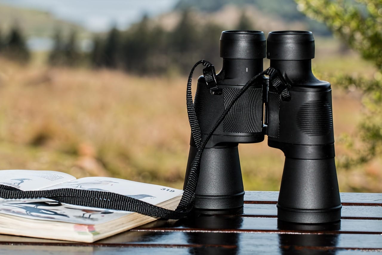
Every spring, thousands of people try birdwatching for the first time. Most of them give up within weeks. The birds are fast, the field guides are thick and every app seems to be made for experts who already know the difference between a reed warbler and a sedge warbler.
A nature charity asked us to design an app for the people who give up: patient, beginner-friendly and built for the first hundred birds, not the last thousand.
Starting in the field
We did not start with screens. Aiko and Sam spent six early mornings on marshes, in parks and in gardens with groups of beginners, watching what they did when they saw a bird they did not know. The pattern was always the same. They saw something, fumbled for their phone and by the time they had opened an app the bird was gone.
That told us two things. The app has to open instantly, straight to the camera or the notebook. And it has to help you after the bird has gone, from memory, not only while it is in front of you.
Beginners do not need more information. They need fewer, better questions.
Aiko Tanaka
Five questions instead of a thousand birds
Most bird apps start with a search box or a long list. Ours starts with five simple questions, each answered with a tap:
- Where were you? Garden, park, water, woods or coast.
- How big was it? Smaller than a sparrow, about a blackbird, about a pigeon or bigger.
- What colour stood out most?
- What was it doing? Feeding, flying, swimming or singing.
- What did the beak look like?
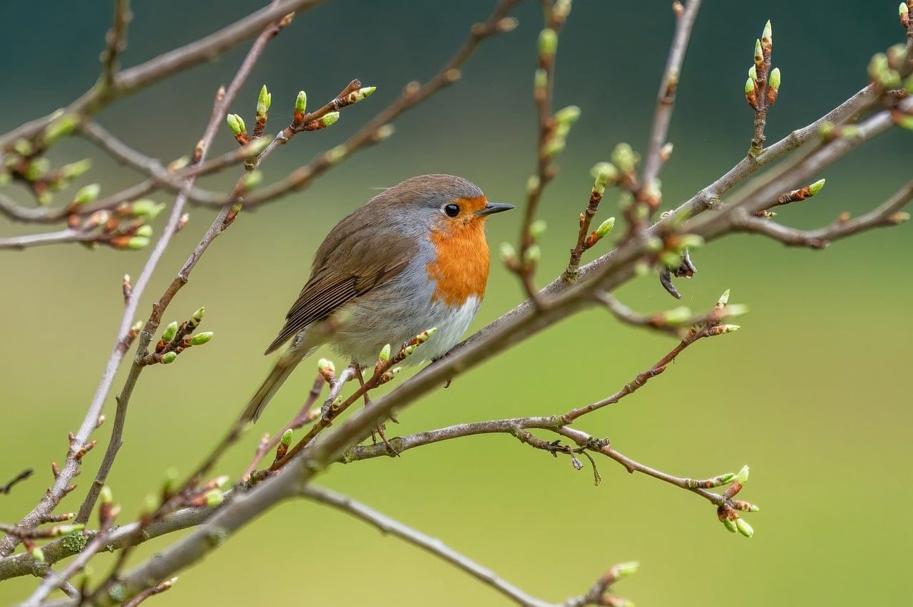
After five taps, the app shows the three most likely birds, with a large photograph of each, in the season and region where you are. In testing, beginners found the right bird in the top three about eight times out of ten.

A diary, not a checklist
Serious birders keep lists. Beginners, we found, prefer stories. So instead of a checklist of species, the app keeps a diary: a page for each walk, with the birds you saw, a note, the weather and a photograph if you managed one.
The diary is private by default. There are no public rankings and no points. Early testers told us that the moment an app started comparing them to other people, they felt like failures and stopped using it.
Designing for the outdoors
A phone on a marsh at six in the morning faces cold hands, bright sunlight and a weak signal. Everything in the app was designed for those conditions.
- Buttons are large enough to press with gloves on.
- The interface has a high-contrast mode that switches on automatically in bright light.
- Every bird's photograph, description and song is stored on the phone, so the app works with no signal at all.
- The diary saves every tap immediately, so nothing is lost if the phone runs out of battery.

Built with the charity's volunteers
The charity has thousands of volunteers who know the local birds far better than we do. We built a simple way for them to add notes to each species: where to find it locally, what time of year to look and what it is often confused with. These notes turned out to be the most loved part of the app. They make it feel like a friend who knows the area is walking alongside you.
After launch
The app launched in April, at the start of the spring migration. In its first season, it was downloaded more than forty thousand times, and the charity reported its highest ever number of first-time volunteers. The figure that mattered most to us was different: three months after installing, more than half of users were still recording walks. For a beginner birding app, that is unusually high.
The sound of the app
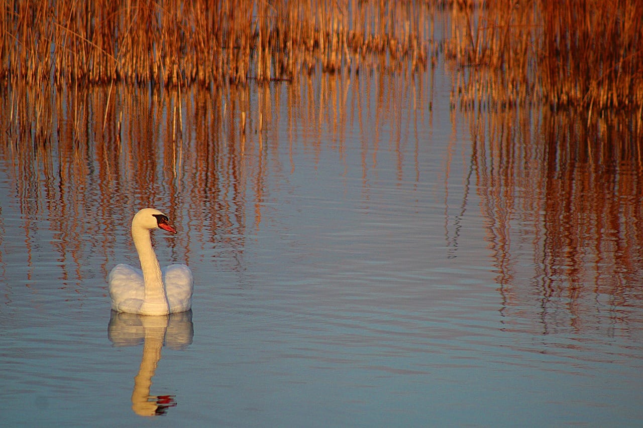
We wanted the app to be quiet, in every sense. There are no notification sounds by default, no buzzing and no bright flashes. On a quiet marsh, a phone that beeps scares away the very birds you came to see. When a sound is needed, for example to confirm that a walk has been saved, the app uses a soft, short tone recorded from a wooden block.
Designing the bird cards
Each bird has a single card with one large photograph, the common name, a short description in plain language and three things to look for. We worked with the charity's experts to write the descriptions for beginners. Instead of pale supercilium, the card for a sedge warbler says a clear pale stripe above the eye, like an eyebrow. Every card was read aloud to a group of beginners, and any word they did not know was replaced.
The photographs were chosen with the same care. Each one shows the bird as a beginner would usually see it: often from a distance, often half hidden, rarely in perfect light.
Credits
Product design by Aiko Tanaka. Research by Aiko Tanaka and Sam Okoye. Illustrations by Tomás Reyes. Built with the charity's in-house developers.