Tidewater Coffee: packaging drawn from the hillside
Contour maps of each farm, a colour for every flavour and bags you can compost at home.
- Services
- Branding, Digital
- Year
- 2026
- Lead
- Tomás Reyes
- Read
- 4 min
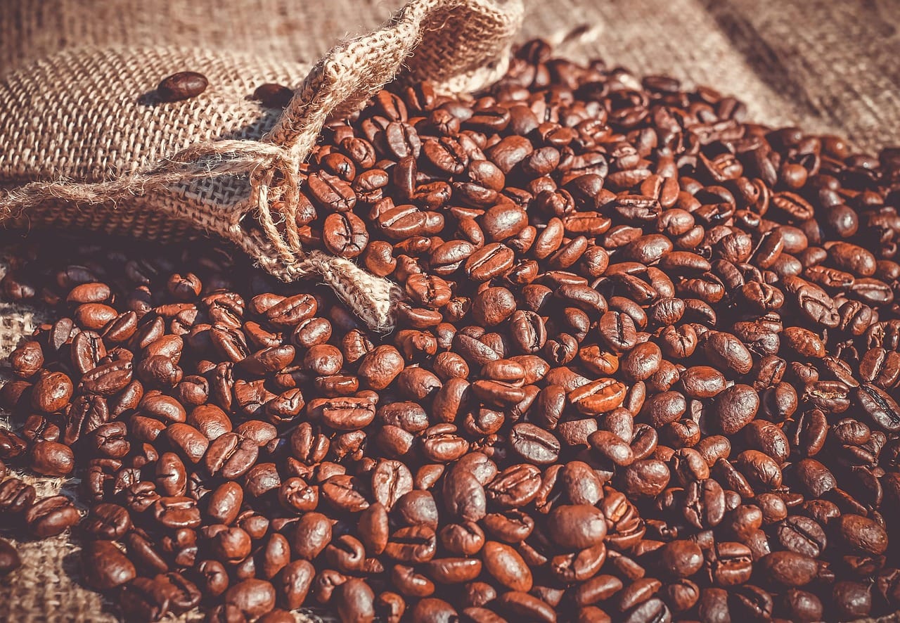
Tidewater is a small coffee roaster with two cafés and a growing online shop. They buy beans directly from farmers in five countries and roast in small batches, twice a week, in a converted warehouse by the harbour. The coffee was excellent. The packaging was a plain brown bag with a sticker, and nobody could tell one coffee from another on the shelf.
Tidewater asked us to design packaging and a small retail identity that tells the story of each coffee without shouting.
Every coffee has a place
Tidewater's coffees are not blends. Each one comes from a single farm or a small group of farms, and the owners know most of the farmers personally. We wanted the packaging to show that. Every bag is designed around a place: the name of the farm, the region, the height at which the coffee was grown and the name of the farmer.
The design of each bag is built from a simple contour map of the farm's hillside, drawn in a single colour. Coffees from higher farms have more contour lines. It is a quiet detail that coffee lovers notice and enjoy.
We wanted the bag to feel like a letter from the farm, not an advertisement.
Tomás Reyes
A colour for every flavour
Most customers do not know the difference between a washed and a natural process coffee, and they should not have to. They know whether they like coffee that tastes bright and fruity or deep and chocolatey. So the colour of each bag describes its flavour, not its origin.
- Warm reds and oranges for fruity, bright coffees.
- Deep browns and ochre for chocolatey, nutty ones.
- Soft greens for the lighter, floral coffees.
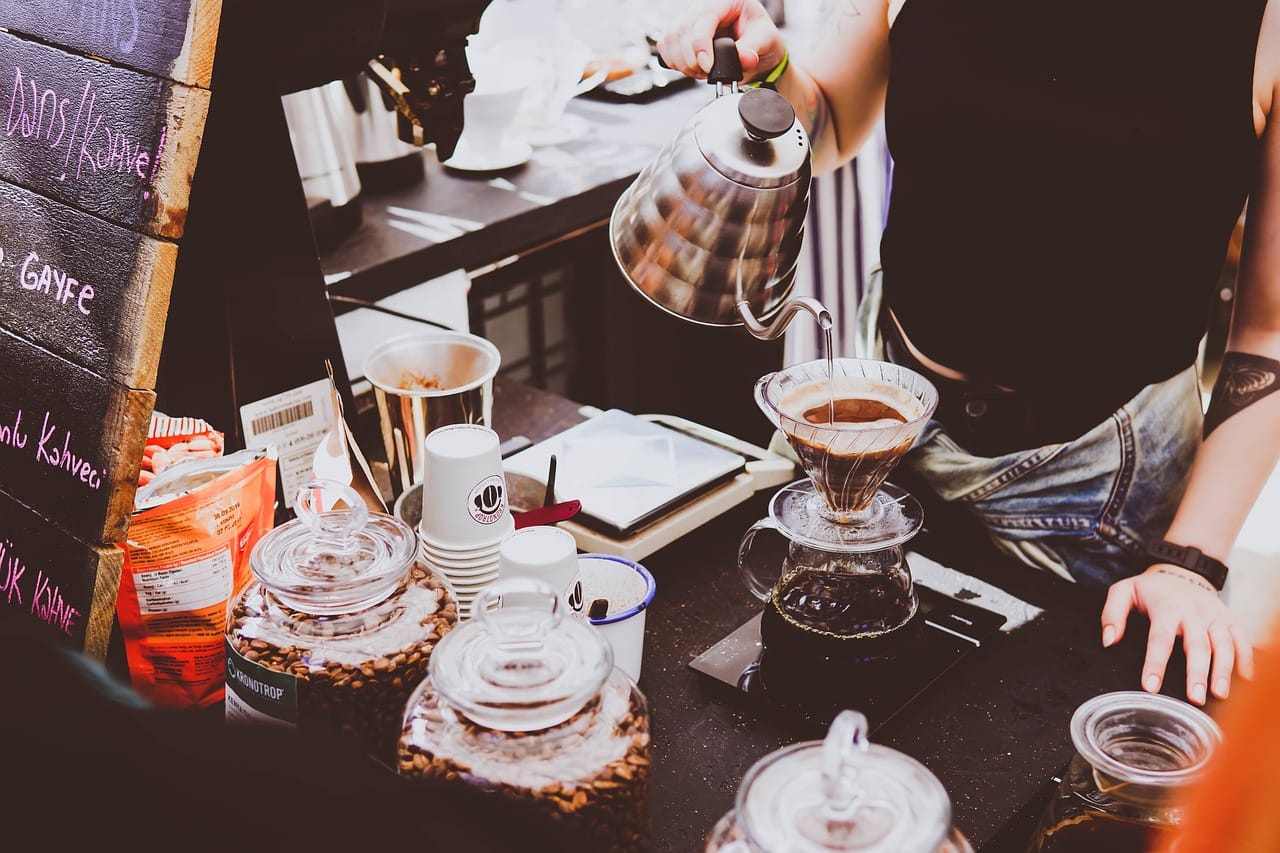
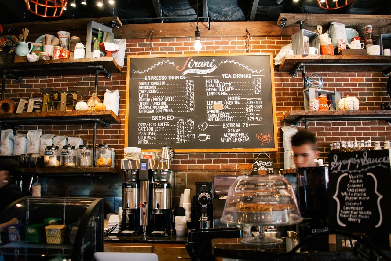
The café staff use the same colours on the menu board, so customers can say I'll have something from the red side without needing to know any coffee vocabulary.
Packaging that can be recycled
The old bags were lined with plastic and aluminium and could not be recycled. We worked with Tidewater and their supplier to switch to a paper bag with a thin plant-based lining that can be composted at home. It keeps the coffee fresh for about six weeks, which is less than the old bags, so Tidewater now roasts smaller batches more often.
The labels are printed on the same paper, with a single ink colour per bag. The contour maps are printed with a slight texture, so you can feel them under your fingers.
The cafés and the online shop
We extended the identity into the two cafés with a light touch: the contour lines as a pattern on the counter, the colour system on the menu and simple signage made from the same wood as the tables. Nothing loud. The coffee and the people making it are the main attraction.
The online shop follows the same idea. Each coffee has a page with its map, the farmer's story and a short tasting note written by the roaster in plain language. Aiko designed a subscription option that lets customers try a different coffee every two weeks, grouped by flavour colour.
Results
In the first six months after launch, online sales doubled and the subscription became Tidewater's fastest growing product. Several of the farmers sent photographs of themselves holding their own bags, which now hang on the café wall. Tidewater's owners say the most important change was harder to measure: customers now ask about the farms, and the staff have better conversations about coffee every day.
Working with the farmers
We could not visit all five countries, but Tidewater's owners travel to the farms every year. Before their spring trip, we gave them a simple kit: a camera, a notebook and a short list of questions for each farmer. What makes your land different? What do you want people to know about your coffee? What is your favourite way to drink it?
The answers became the stories printed inside each bag and on the online shop. They are short, personal and often funny. One farmer's favourite way to drink coffee is cold, the next morning, from the pot nobody finished. Customers love these stories, and several farmers have since received letters from people who bought their coffee in Rotterdam.
The subscription box
For subscribers, we designed a simple box that fits through a letterbox, so it never needs a signature. Inside is the bag, a small card with the farmer's story and a postcard of the farm's contour map. Many subscribers collect the postcards; one sent us a photograph of a whole wall covered with them.
Credits
Packaging design by Tomás Reyes. Maps and illustration by Tomás Reyes and Lena Brandt. Online shop by Aiko Tanaka. Photography by Sam Okoye.